Changes are in full swing in Instagram to keep up with the competition, which could be imitated with a new feed for full-screen photos, while the user experience could improve by bringing the Compose button back down.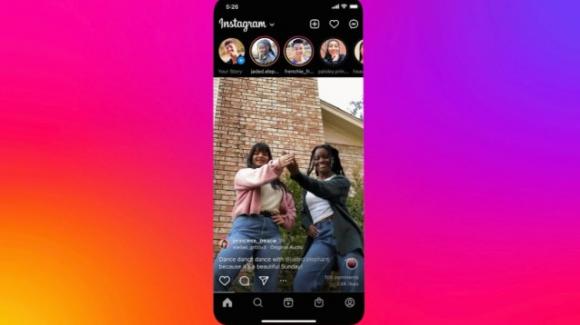
Listen to this article
The famous Instagram platform, increasingly taken in its attempt to face TikTok, in the past few hours has announced the next launch of a test via app, to improve the display of photos and the navigation bar. In the meantime, the annoying bug that plagued the Stories has been resolved.
In recent days, Instagram has suffered, both on Android and on iOS, a curious as well as annoying and widespread bug resulting from the fact that its algorithm forgot the order in which the Stories were displayed, repeating the same ones several times, before it was possible to switch to a new. Aware of the problem, in the past few hours Instagram has released a new stable release, this time free of bugs which, with code number 239.1, specifies in the changelog how it contains “bug fixes and performance improvements”.
Another news officially announced by Instagram concerns the start of a test. Mark Zuckerberg, in reiterating that “photos are still an important part of Instagram”, bypassing his colleague Adam Mosseri, announced the start of a test to view images in full screen in the Feed, basically in TikTok style. Last May, the platform performed a similar test, overwhelmed with criticism: users complained that all photos, even horizontal or square ones, were rendered in 9:16 format, with the consequence that Instagram forced the adaptation by including one where necessary. blurred background. The posts, then, did not follow each other just like on TikTok, since – before and after each of them – an annoying white space was found.
Last but not least, so to speak, in last month’s test, the display of photos on the internal screen hid captions and comments. It is not yet clear in what the new test, which should appear shortly in the app, will differ from the previous one in acknowledging the aforementioned complaints, even if, when asked about it, the platform assured TechCrunch that it will no longer reveal white spaces. before and after posts.
From a spokesperson for the platform, however, came the admission that the test promised by Mark Zuckerberg will also have another element of differentiation compared to May, since it will be the right opportunity to try a different location for the Dial button, which in the 2020 had been dislodged at the top right to make room for the Reels board at the bottom. Now, evidently in the face of a decline in the creation of new quick posts, we are considering bringing it back to the lower navigation bar, where it will keep company with the shortcut for accessing messages.